Tips To Create A Beautifully Styled Home
Does your home feel a little uninspired, like it’s missing that cozy, polished touch? Styling a space can feel overwhelming, but with a few simple elements, you can effortlessly create a home that looks and feels beautifully put together.
Styling your home doesn’t have to be complicated or expensive. Whether you’re giving a room a mini refresh or doing a full makeover, certain design principles make a big impact. The best part? You don’t need to be a professional interior designer to make your home look stunning.
By focusing on a few key styling elements, you can transform any space into something cohesive, inviting, and effortlessly beautiful. The trick is knowing how to Create A Beautifully Styled Home. Let’s dive into some simple yet powerful Tips to Create a Beautifully Styled home and techniques that will instantly elevate your home.
The Power Of Texture
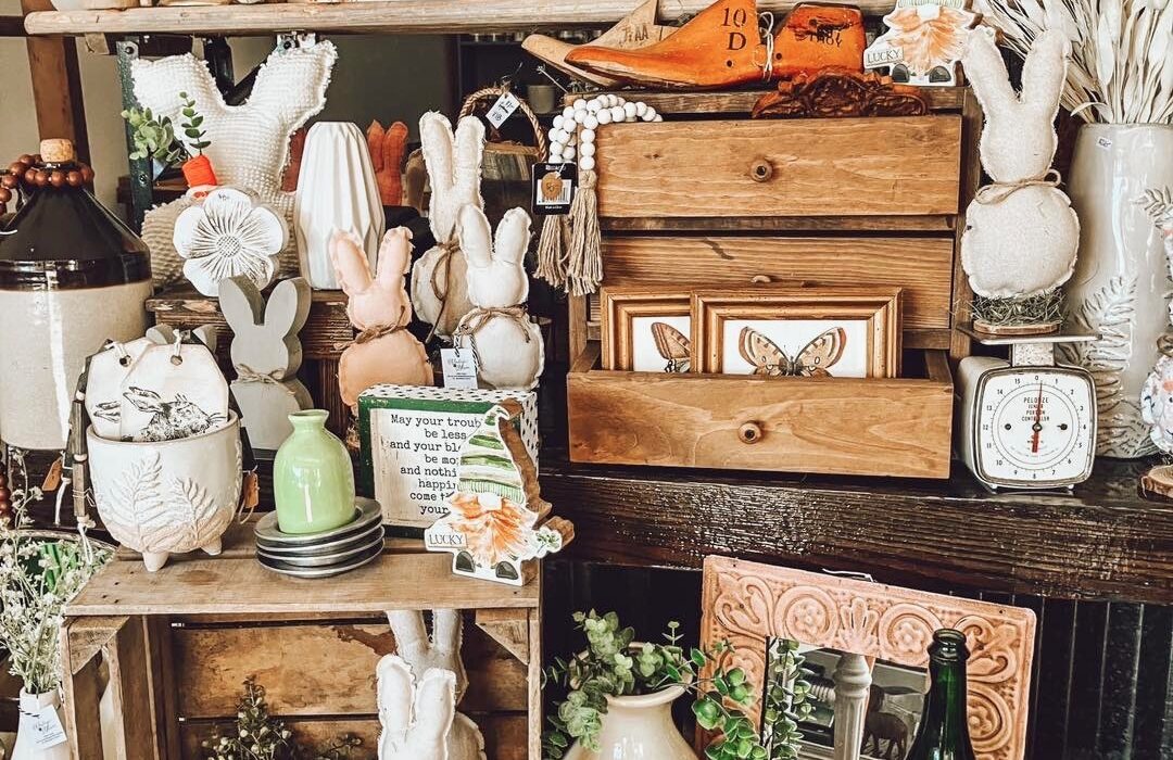
Texture is one of the easiest ways to add depth and personality to a room. If a space feels a little bland or flat, chances are it’s missing a mix of materials that create contrast and warmth.
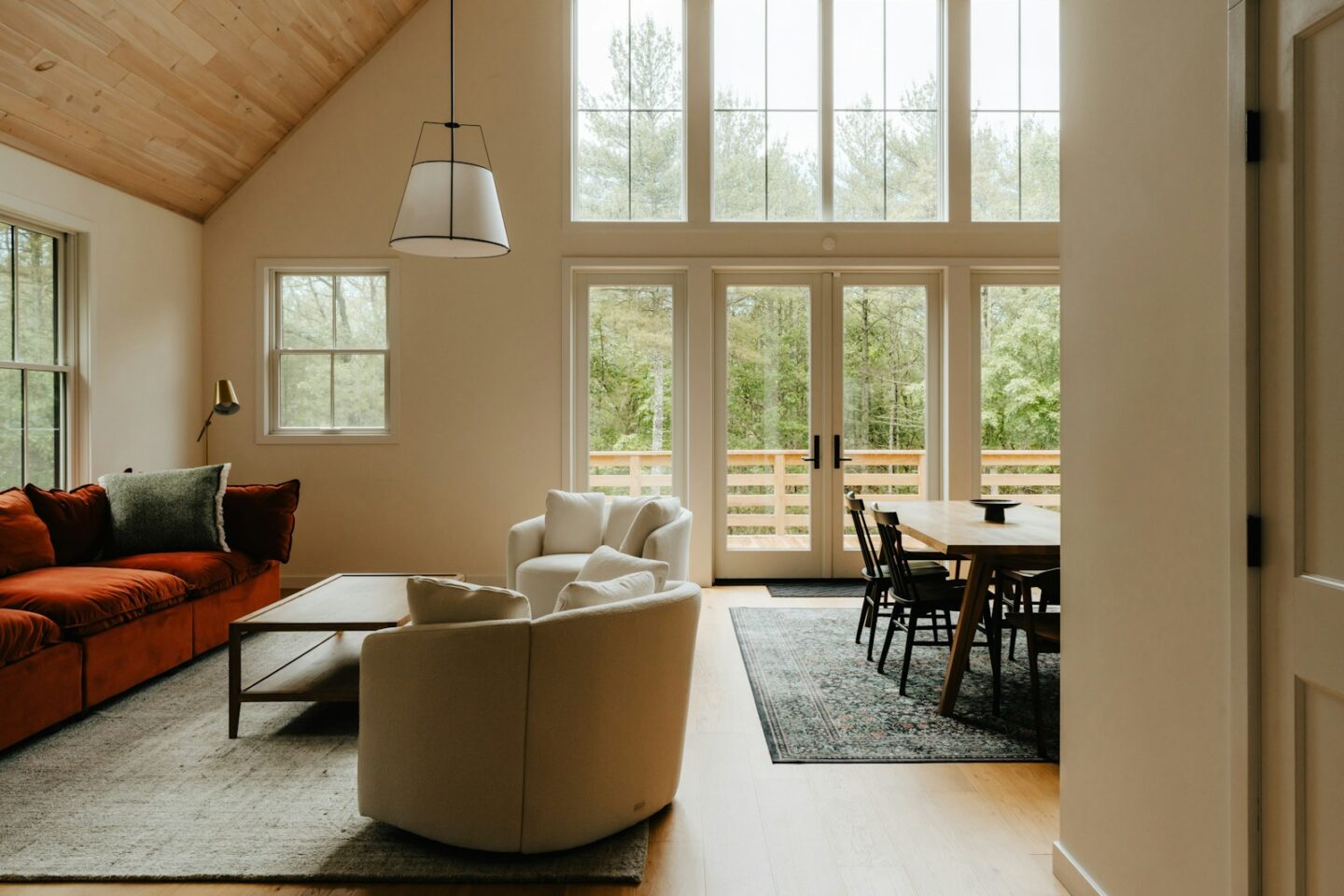
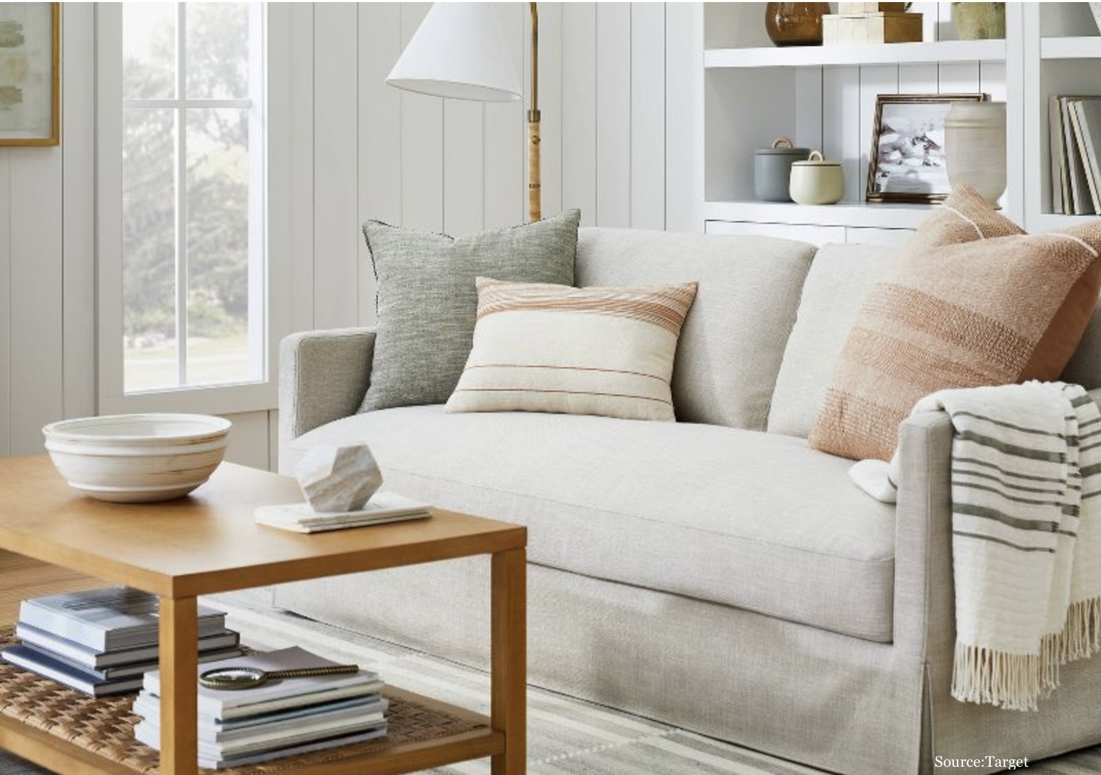
– Soft & Cozy – Layering different fabric textures is a great way to make your home feel inviting. Try adding a chunky knit throw on a linen sofa, velvet pillows on a cotton bedspread, or a jute rug on hardwood floors.
– Natural Elements – Wood, stone, rattan, and clay add organic warmth and a timeless look. A distressed wooden coffee table, a stone planter, or woven baskets bring that natural feel.
– Unexpected Details – Think about incorporating texture in smaller, unexpected ways—macramé wall hangings, beaded chandeliers, or even a sculptural vase can add just the right amount of interest.
The goal is to create contrast and dimension. If everything in the room feels too smooth or too uniform, it can look flat. Mixing up textures brings life to your space!
Contrast For Visual Interest
One of the biggest secrets to a well-styled home is contrast. This doesn’t mean stark opposites—it’s about creating balance and keeping the eye moving through a space.
Here’s how to add contrast like a pro:
Shape Contrast
If you have a rectangular coffee table, add a round bowl or curved vase on top. Pair square throw pillows with a round bolster pillow for a layered look.
Color Contrast
Dark furniture against light walls creates an immediate focal point. If your room leans neutral, add pops of color through artwork, flowers, or a bold area rug.
Material Contrast
Matte and glossy, rough and smooth—mixing materials makes a space more dynamic. A polished marble tabletop with rustic wood chairs? Yes, please!
Too much of one thing can make a space feel monotonous. Adding contrast creates dimension and keeps things visually engaging.
The Magic Of Metals
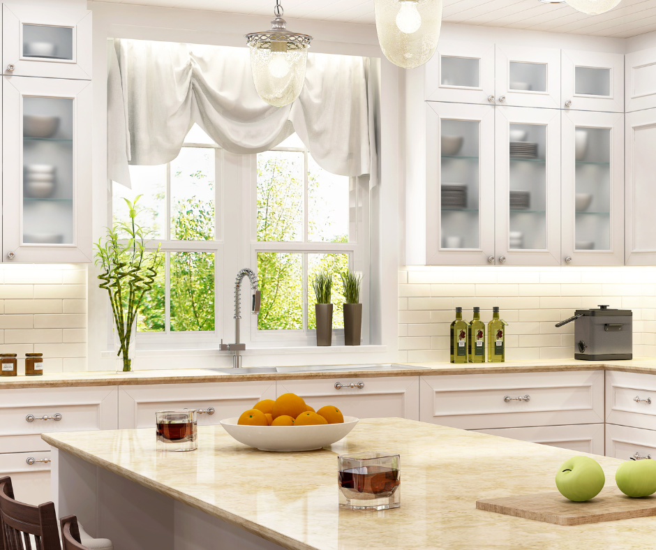
Think of metals as the jewelry of your home. The right metallic accents add elegance, warmth, and a hint of sparkle without overwhelming the space.
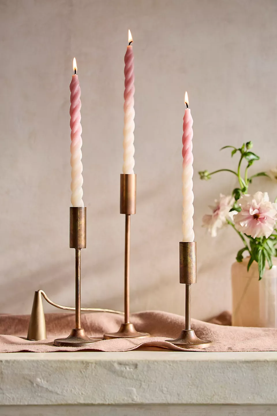
– Gold & Brass – Warm, classic, and timeless. Perfect for drawer pulls, picture frames, and light fixtures.
– Silver & Chrome – Sleek, modern, and sophisticated. Works well in kitchens and bathrooms.
– Black Iron & Bronze – Industrial, rustic, and grounding. These metals add character and richness to a space.
A good rule of thumb? Stick to 2-3 metal finishes per room. Mixing metals can look intentional and curated, but too many different finishes can feel chaotic. A brass mirror, black hardware, and a chrome lamp, for example, create a beautifully layered look.
Bring In A Little Greenery
Plants instantly make a room feel more inviting and fresh. Whether it’s a lush indoor tree or a simple potted succulent, greenery adds an organic touch that softens any space.
– Low-Maintenance Favorites – Snake plants, pothos, and ZZ plants are great options for those without a green thumb.
– Faux Plants That Look Real – If you struggle to keep plants alive, high-quality faux plants have come a long way! A well-placed faux fiddle-leaf fig or eucalyptus stems in a vase can work just as well.
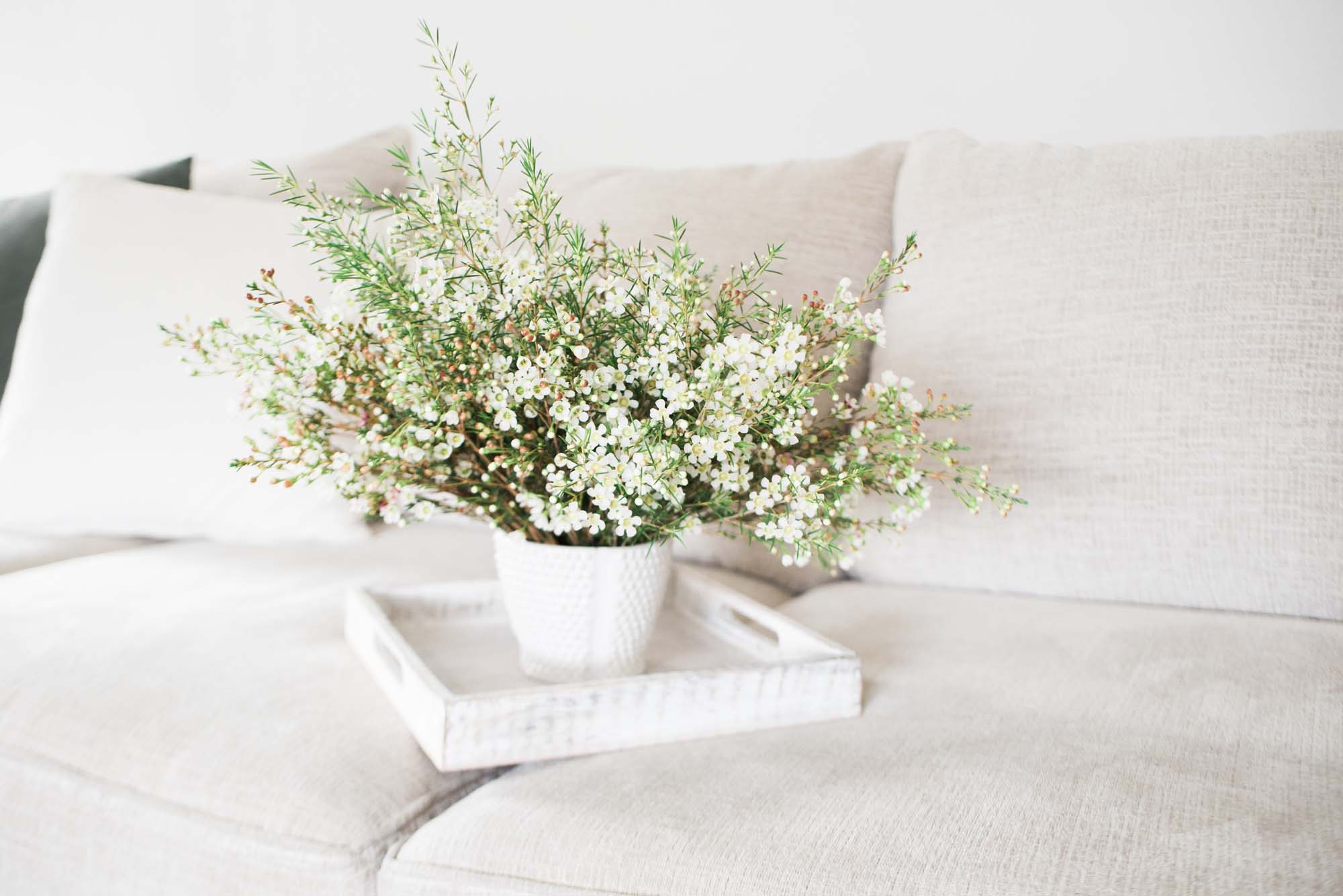
– Fresh Flowers – A simple bouquet of seasonal flowers on the dining table or nightstand is an effortless way to bring in color and texture.
Pro tip: Use different-sized planters and stands to create varying heights for more visual appeal.
The Art of Placement & the Rule of Three
Arranging decor can feel overwhelming, but there’s a simple trick designers swear by: The Rule of Three.
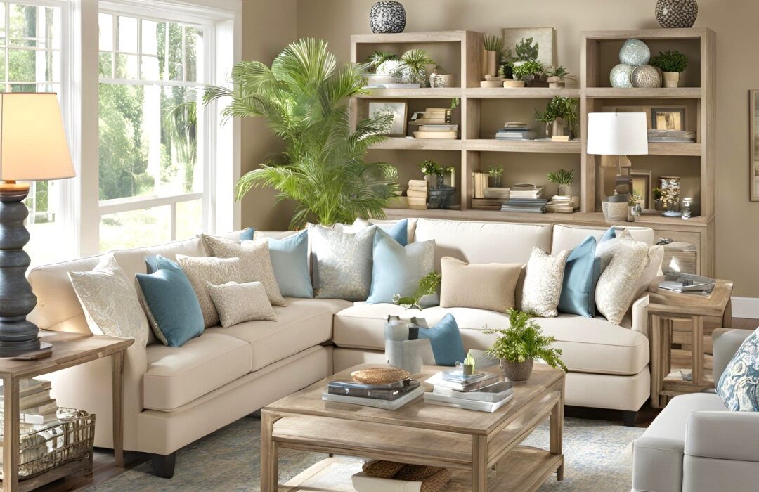
When styling a coffee table, console, or bookshelf, grouping items in threes creates balance and interest. Here’s how to do it:
– Three Different Heights – Stack a book, add a candle, and place a small vase on top. This layered look adds movement.
– Mix Shapes & Materials – A round vase, a square book, and a textured ceramic bowl create variety and interest.
– Create Negative Space – Not every inch of a shelf needs to be filled. Leave some breathing room so your decor doesn’t feel cluttered.
Styling is about playing around with placements until everything feels just right. Trust your instincts and have fun with it!
Note: Easy guide is to use repetition; for example, stack books or magazines rather than having one on its own.
So, whether you’re rearranging your coffee table, adding a few metallic accents, or finally bringing in that cozy throw blanket, remember—small changes can make a big difference. Take your time, enjoy the process, and most importantly, have fun creating a space you love!
Bringing It All Together
When you walk into a well-designed space, it just feels right. That’s because all the elements—texture, contrast, metals, greenery, and placement—are working together in harmony. The good news? You don’t need a big budget or professional training to achieve this look in your own home.
Start small! Try swapping out a few pillows, adding a plant, or reworking your coffee table decor. Little changes can make a big impact.
And remember, styling should be fun! Your home is a reflection of you—so make it a place you love.
Conclusion
Styling your home doesn’t have to be complicated or expensive. By focusing on simple yet impactful elements—like texture, contrast, and greenery—you can create a space that feels both stylish and inviting. The best part? You don’t need to follow strict design rules. Trust your instincts, play around with what you have, and make your home a true reflection of you.
Now, tell me—what’s your favorite styling element? Let’s chat in the comments!
Before You Go . .
Enjoyed this post? Let’s stay connected!
📌 Follow me on Pinterest for daily home inspiration!
📷 Join me on Instagram for behind-the-scenes styling tips.
🛍 Shop my favorite home finds here.
📧 Subscribe to my newsletter for exclusive styling tips & freebies!
This post may contain affiliate links. This means I may earn a small commission at no extra cost to you when you make a purchase. Thank you for supporting The City Cottage!
